Laura
Info.Designed by Paul Harpin, assisted by Paul Hickson
Released in 2012
When Paul Harpin’s niece Laura died of cancer at a criminally early age he decided to do what he could to raise funds and awareness in the fight against this ravaging disease.
The former Haymarket Media Group Creative Director set about designing his first typeface and establishing the BuyFontsSaveLives campaign.
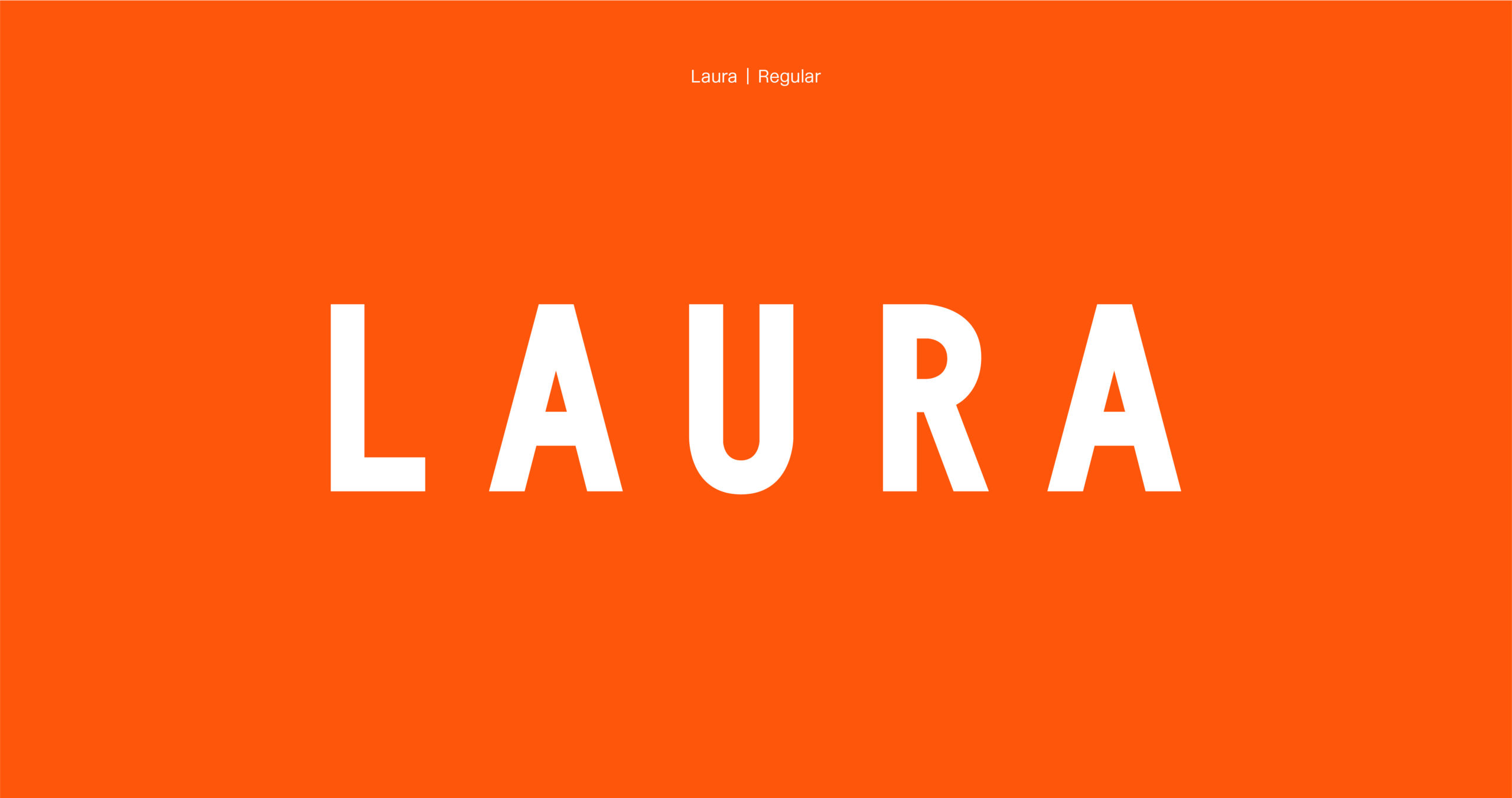
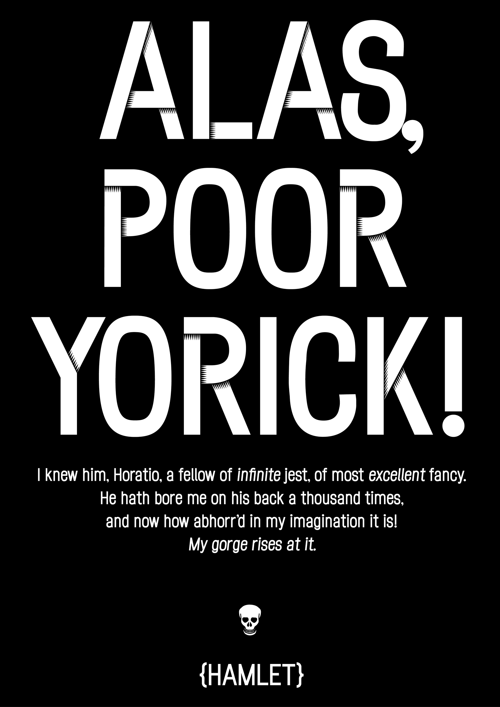
The Laura type family is a set of narrow grotesque fonts with a large x-height. Unlike most narrow grotesques it has a hand drawn feel. It is not drawn with a compass and ruler. It’s a humanist font with curves and circular punctuation.
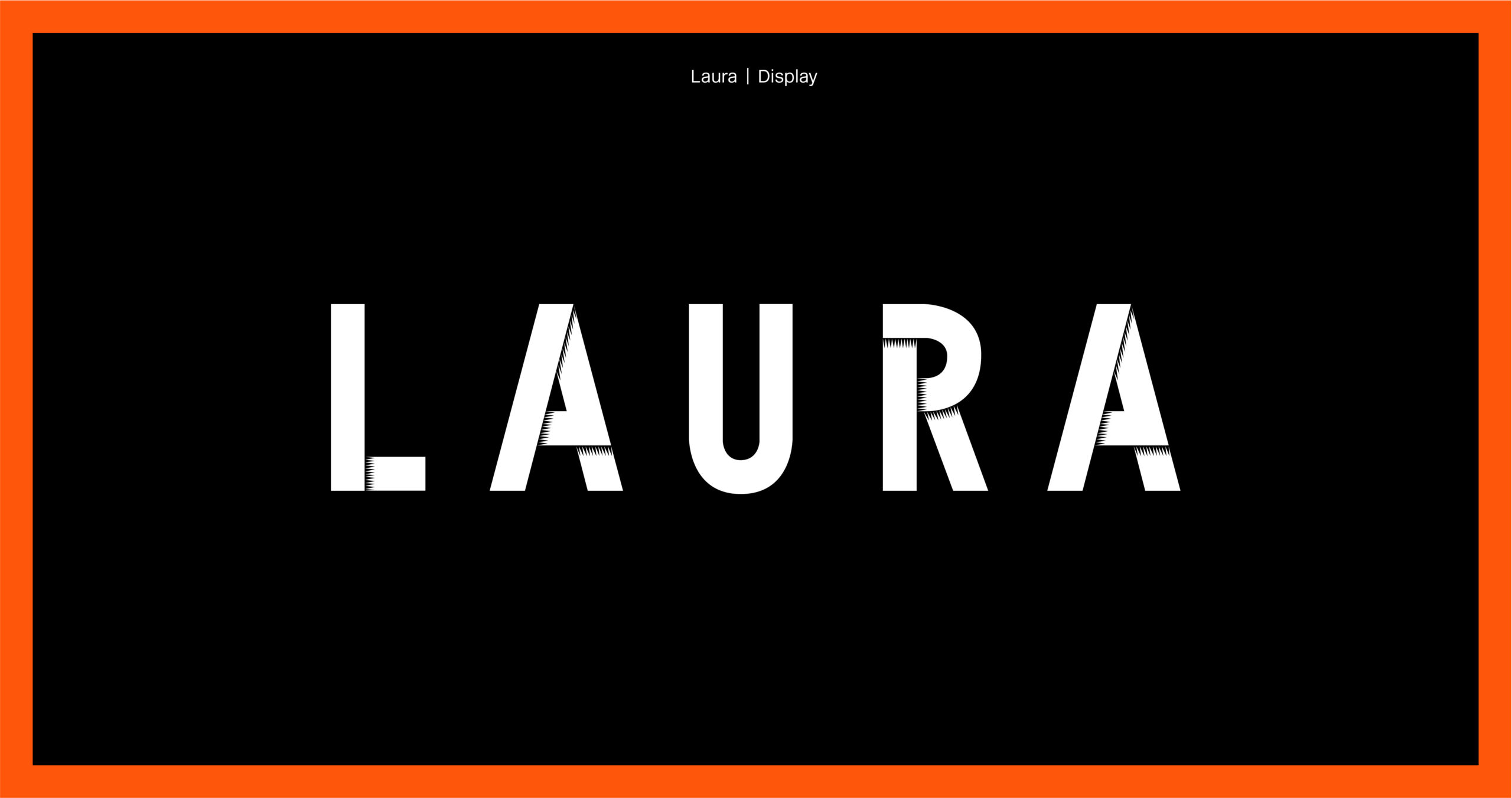
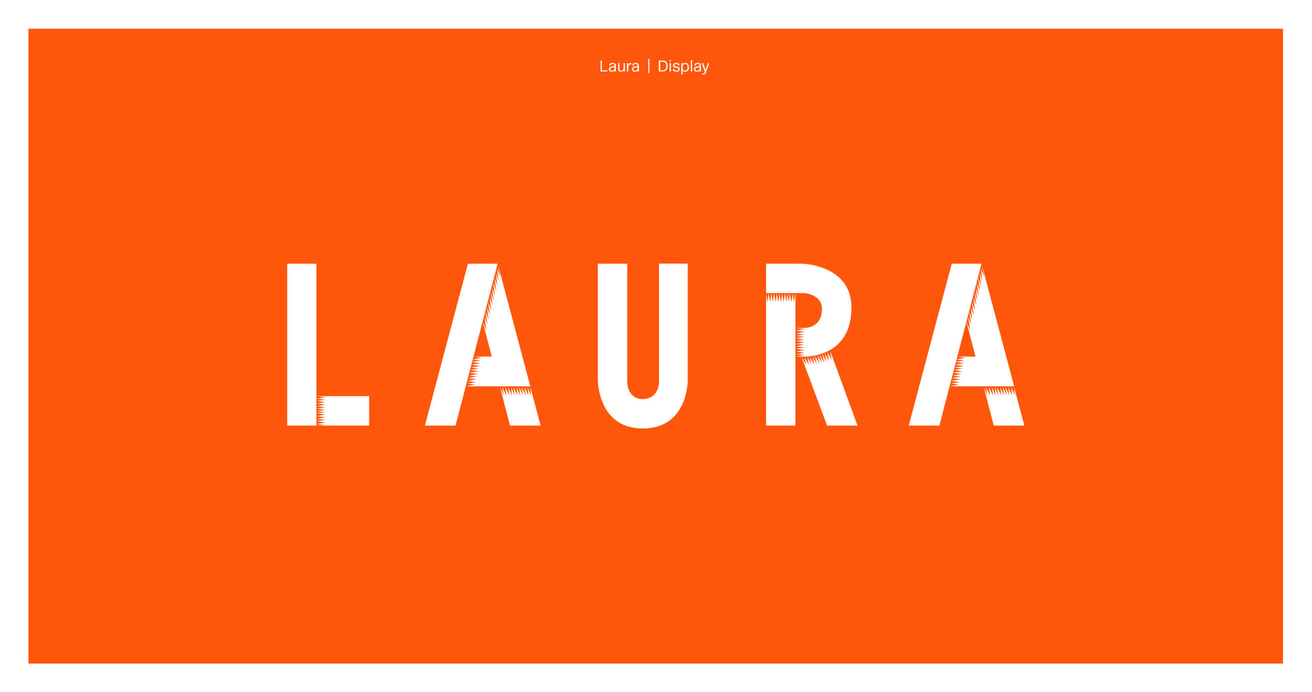
Available in two variations initially – Plain and Display – each style has twelve weights with matching italics.
Laura Regular & Laura Display
Type Your Own Words
px
Fonts In Use
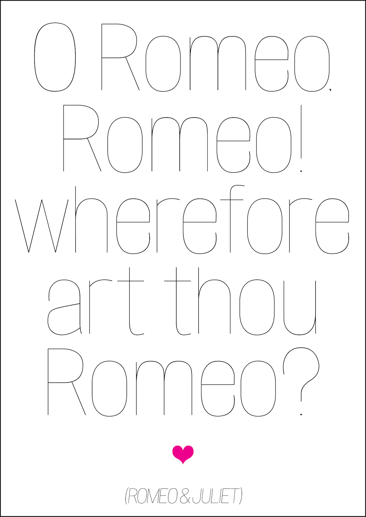
Shakespeare Poster #1
Shakespeare Poster #2